PHASE 3
Develop - Ideation and Evaluation
In the Development phase we began to ideate the concept of the Binnie Bins as well as the primary features and design of our mobile application. We accomplished this through our wireframing process, user flow site-mapping, as well as creating a brand style guide to ensure consistency.
the tangible product design
From our user interviews and survey results, users presented the concern of composting requiring too much space. We wanted to create a Binnie Bin that did not feel intrusive or obstructive in the user’s households.
HOW IT WORKS:
The unique feature of our bins is that it links up to the Binnie Mobile App and personally tracks your compostable waste on the user’s behalf. By incorporating a sensor within each bin, once a large portion of the bin has been filled, the user is notified of the bin’s capacity through the app.

PHYSICAL DESIGN:
By creating a bin that was customizable, we felt this provided a wider range of accessibility to our products to engage various household sizes. Our bins were designed to be no larger than your average household trash can, made of a stainless steel exterior to achieve a more sleek and adaptable product overall. The user has the ability to request either 1 to 3 bins at a time through the application. If the user decides to order more than one bit at a time, our bins have the ability to magnetically combine with the other bins that may have been requested.

VIEW FULL SITE MAP 2.0
1ST ITERATION OF WIREFRAMES
Now that we had created a physical design of the tangible product, we began to ideate the mobile application through multiple wireframes and low-fidelity prototypes.
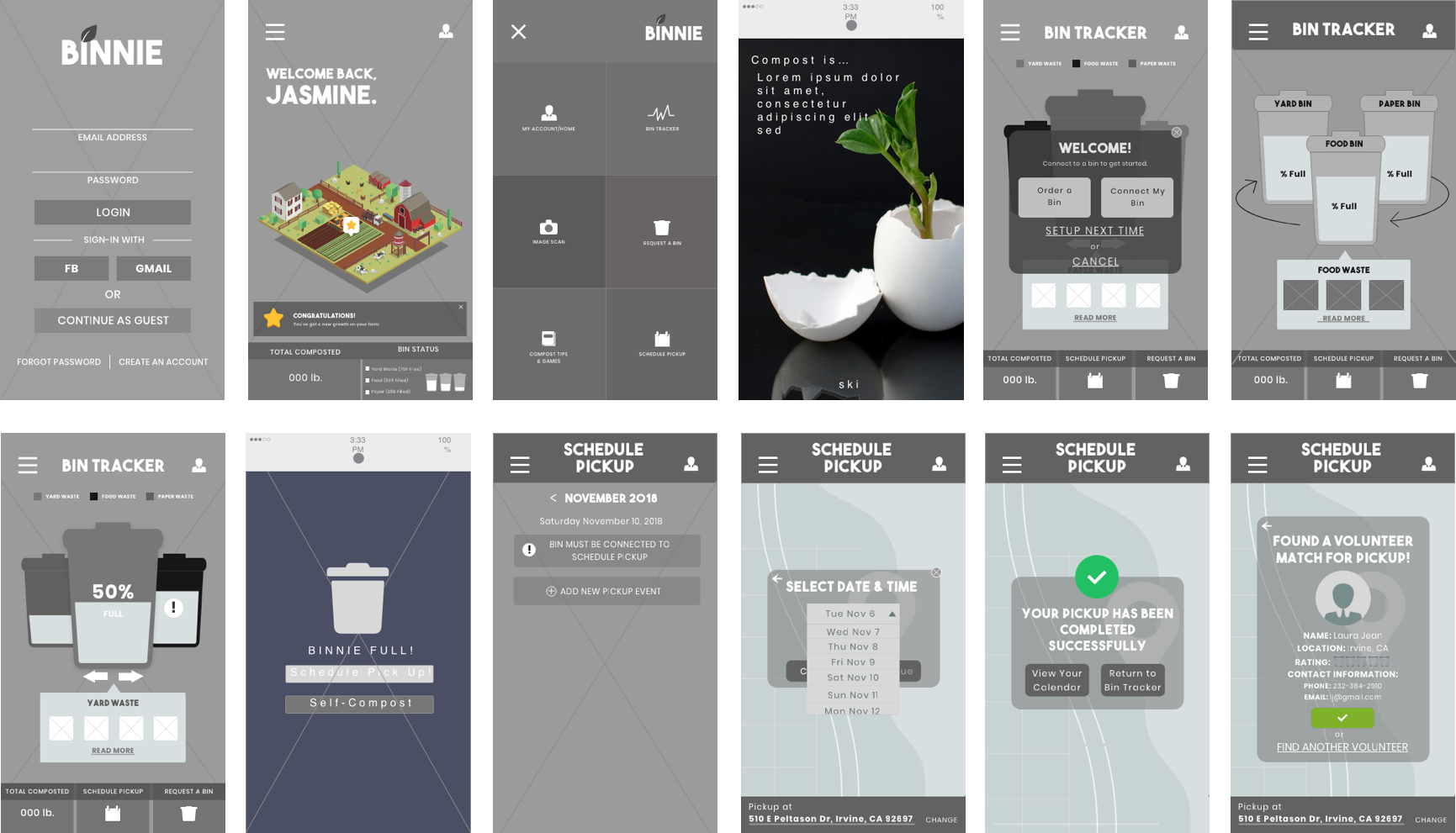
1ST ITERATION OF WIREFRAMES
The initial pages we focused on were the login screen, homepage, navigation menu, request a bin page, bin tracker, scheduling pickup and calendar page. In order to address the initial concerns presented by the research we analyzed, we felt these particular screens were important for the starting phase of our application design.

Each of our team members created their own interpretation of the redesign and presented their design solutions to the rest of the members. From there we collaboratively looked over the designs, marking which design suggestions we wanted to iterate upon further, and the design suggestions we wanted to omit.
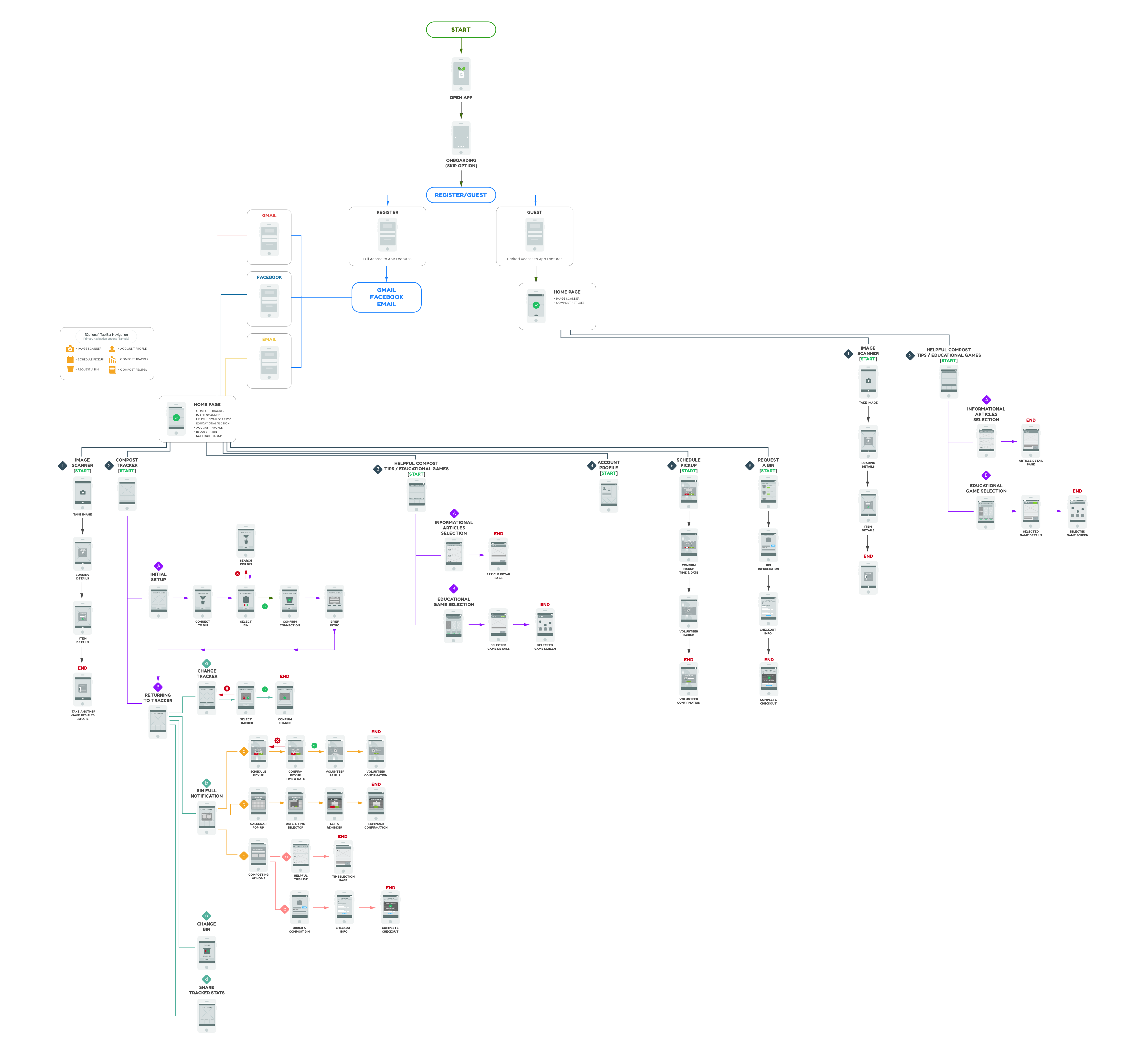
APPLICATION SITE-MAP & MAIN USERFLOW
The next phase in development led us to mapping out our entire mobile application, allowing us to organize all the main features we envisioned for the application. Through the site-map we were able to design our application’s overall user flow, illustrating all possible pathways a user could take.

While incorporating brighter and bolder colors into the style guide, our team still wanted to maintain the professional and polished reputation of a non-profit organization. We aimed to balance modern professionalism with playful boldness.

The same inspiration followed our typeface and font family choices. Our main headings were displayed with a more playful typeface while the body text remained modern and polished.
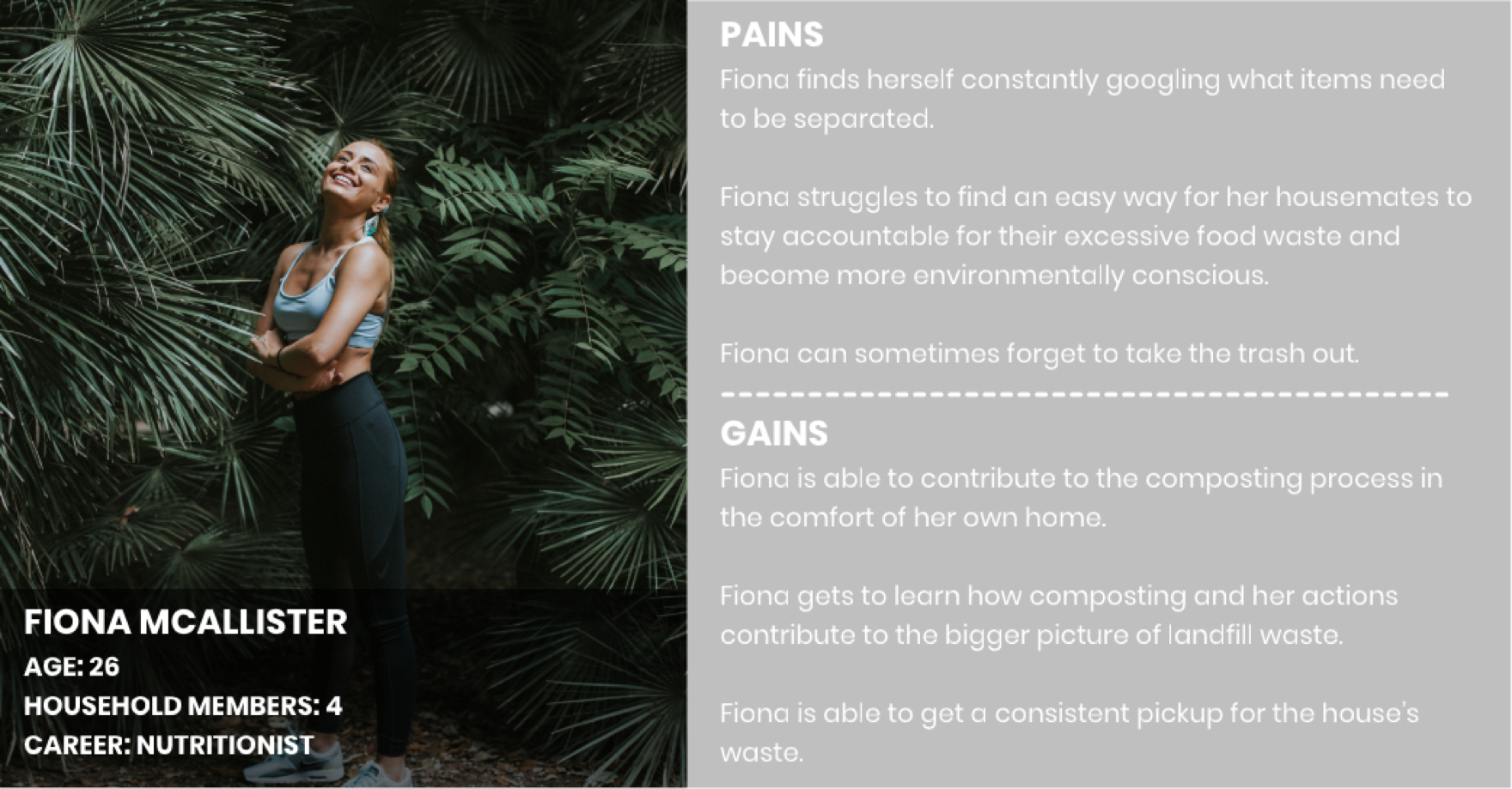
EXPLORING THE 2 MAIN USER CASES
We designed 2 main user paths, the returning user and the guest user. Our team wanted to ensure our application was accessible to various user types. Our team determined that the primary features of the application were going to be:
- A Bin Tracker - Where users can track the status of the Binnie Bin capacity. Helping users also determine which bin may need to be picked up.
- A Request a Bin Page - Where users can place the initial request for their complementary Binnie Bins to begin their composting journey.
- A Schedule Pickup/Calendar Page - Where users can manage their bin pickup appointments (Scheduling a pickup to keeping track of their pickup schedule).
- An Image Scanner - A tool provided for users to verify items they may not be certain is compostable or not, through their personally captured image.
- An Educational Games & Articles Page - A resource provided to users who want to further their knowledge of composting by learning basic fundamentals, to staying updated on the latest composting practices.
After determining the primary features of the application, our team deducted that the majority of the features would require the users to create an account with Binnie. The reasoning primarily being that the Bin Tracker, Request a Bin, and Schedule Pickup requires information from the user in order to carry out the action. Therefore by creating the account, the interaction would then be managed on our platform through an established account. However the Image Scanner, Educational Game and Article Page we would want to make available to all users so that these tools and resources can be used as useful guides for anyone interested in composting.
To highlight the main feature and purpose of our application, below is the primary user flow that will be demonstrated in the finalized prototype.
SCHEDULING A BIN PICKUP - USER FLOW


Creating a Responsive Website:
We believed that the AALOC website should have a responsive web design so that users on all different devices would have a positive interaction with the interface. Also to optimize the accessibility options for various users.
After establishing the style guide, our team proceeded to create the high fidelity mockups.
ESTABLISHING BRAND IDENTITY & DESIGN CONSISTENCY
Our team created Binnie’s official style guide by establishing the app’s color palette, button elements, iconography, and typeface. We envisioned Binnie to have a bright, bold, and unique user interface as opposed to the color palette of our competitors (various shades of green and brown with a dominant white background). However, like our competitors we still wanted our color palette to reflect a natural, organic theme to represent the foods and materials the user would be composting.
For Binnie we chose to revolve around (#F7812A), a deep orange shade, as the primary UI color, with a highly contrasting bright blue, almost teal color (#12C0BC) as the main CTA (call-to-action) indicator. Binnie’s primary background also incorporates a gradient as the static background (a deep orange #F76B1C to a soft pastel yellow #FAD961 gradient).
We have 6 different types of buttons incorporated into our style guide. The larger, rectangular, teal color would be used in the card elements found throughout our application. While the rounded buttons are the dominant button forms found throughout the application. The main action will be indicated by the bright blue, teal color, while other secondary actions will be a slightly transparent dark gray button to avoid competing for the user’s attention.


For our typeface, we selected THE BOLD FONT for the main headings and Poppins for sub-headings, body style, and small text. These typefaces were selected to mimic the bold and playful UI we had envisioned for the app. Although both typefaces are playful, we felt it also conveyed a very modern characteristic as a sans-serif font.

