Project role

UX Designer & Researcher

skills

UX Research & Design
User Interviews
Wireframing/Prototyping
A/B Testing
Responsive Web Design
Information Architecture

tools

Sketch
Adobe XD
Adobe Illustrator
InVision App

project length

2 Weeks

Project role

UX Designer & Researcher

skills

UX Research & Design
User Interviews
Wireframing/Prototyping
A/B Testing
Responsive Web Design
Information Architecture

tools

Sketch
Adobe XD
Adobe Illustrator
InVision App

project length

2 Weeks
ANIMAL ASSISTANCE LEAGUE OF ORANGE COUNTY

THEIR WELFARE IS IN OUR HANDS.

Our team took on the challenge of redesigning the Animal Assistance League of Orange County’s (AALOC) website. This particular website serves as a platform for a non-profit organization whose mission is “...dedicated to aiding lost and homeless pets, helping people with pet related problems, promoting responsible pet-ownership, pet population control, and preventing cruelty to animals through educational programs.”

At the start of this project, we knew that we needed to approach this project from two positions in order to improve the overall experience:
From a Non-Profit’s Perspective:
As a non-profit organization the main priority of the website is to promote pet adoption, attract potential volunteers, and encourage fellow animal enthusiasts to support the shelter financially. By keeping the organization’s focal points in mind, our team would have to ensure that our new design solution emphasized these priorities.
From a Core User’s Perspective:
As a potential adoptee, users would want to feel well-informed and secure in their decision to adopt from the AALOC website. By ensuring the website maintains credibility and informational consistency, future pet owners will feel more confident in their decision to work with AALOC.
VIEW PROTOTYPE

ANIMAL ASSISTANCE LEAGUE OF ORANGE COUNTY

their WELFARE IS IN OUR HANDS.

Our team took on the challenge of redesigning the Animal Assistance League of Orange County’s (AALOC) website. This particular website serves as a platform for a non-profit organization whose mission is “...dedicated to aiding lost and homeless pets, helping people with pet related problems, promoting responsible pet-ownership, pet population control, and preventing cruelty to animals through educational programs.”

At the start of this project, we knew that we needed to approach this project from two positions in order to improve the overall experience:

FROM A NON-PROFIT'S PERSPECTIVE:
As a non-profit organization the main priority of the website is to promote pet adoption, attract potential volunteers, and encourage fellow animal enthusiasts to support the shelter financially. By keeping the organization’s focal points in mind, our team would have to ensure that our new design solution emphasized these priorities.

FROM A CORE USER'S PERSPECTIVE:
As a potential adoptee, users would want to feel well-informed and secure in their decision to adopt from the AALOC website. By ensuring the website maintains credibility and informational consistency, future pet owners will feel more confident in their decision to work with AALOC.

INTRODUCTION

For this project, our team of 4 UX and UI designers were challenged to redesign a non-profit organization’s website. We chose to look towards animal related, non-profit organizations and stumbled upon Animal Assistance League of Orange County (AALOC).  AALOC is a 501(c)3 no-kill humane society dedicated to aiding lost and homeless pets. After browsing through their webpage however, we were concerned about the overall usability of the site.

first impressions - web audit

www.aaloc.org

PET INFO - 1

PET INFO - 2

home page

adoption form

section of footer

  1. Terminology used throughout the pet information section is inconsistent. (i.e. Special Needs - None vs. Special Needs - “blank”).
  2. If response is provided in Pet Information section, the responses leave the user confused (i.e. Good With Kids - “Most Likely”, Good With Kids - “yes?”).
  3. Although advertising may be an additional revenue source for the animal shelter, we felt the ad placement in the initial landing page was very distracting and confusing. Does not help contribute to the Animal Shelter’s reputation and image. Perhaps if a pet was included with the ad imagery, it may appear more relative to the page content.
  4. Once the user decides on a pet that they are interested in the adoption form does not pre-fill the information (i.e. Name of Pet). Also as the text fields are marked as required, users do not have the pet information readily available as they fill out the adoption form. This potentially causes users to go back and forth between pages.
  5. Specific questions such as, “What special needs have you been told will be needed by this pet after adoption?” is a question most users would not be able to fill-out. Especially if the information provided about the pet is not clear and consistent.
  6. Inconsistency in styling. (i.e. icons different fill color).
In summary our initial audit of the website led to the following conclusions:
  1. Lack of Consistency in Information Provided & Credibility.
  2. Inconsistency with Brand Identity.
  3. Ambiguous Terminology.
  4. No Clear User Flow.
Although the main purpose of the AALOC is to aid future adoptees in adopting a new pet, we felt the site may actually cause more confusion, uncertainty, and discouragement towards the actual adoption process.
THE CHALLENGE
Future Pet Owners currently visiting the AALOC website are not able to complete the adoption process online efficiently.  How would we improve the overall usability of the website, as well as create informational uniformity without overwhelming potential users?

introduction

For this project, our team of 4 UX and UI designers were challenged to redesign a non-profit organization’s website. We chose to look towards animal related, non-profit organizations and stumbled upon Animal Assistance League of Orange County (AALOC).  AALOC is a 501(c)3 no-kill humane society dedicated to aiding lost and homeless pets. After browsing through their webpage however, we were concerned about the overall usability of the site.

FIRST IMPRESSIONS - WEB AUDIT

www.aaloc.org

PET INFO - 1

PET INFO - 2

HOMEPAGE

ADOPTION FORM

FOOTER SECTION

  1. Terminology used throughout the pet information section is inconsistent. (i.e. Special Needs - None vs. Special Needs - “blank”).
  2. If response is provided in Pet Information section, the responses leave the user confused (i.e. Good With Kids - “Most Likely”, Good With Kids - “yes?”).
  3. Although advertising may be an additional revenue source for the animal shelter, we felt the ad placement in the initial landing page was very distracting and confusing. Does not help contribute to the Animal Shelter’s reputation and image. Perhaps if a pet was included with the ad imagery, it may appear more relative to the page content.
  4. Once the user decides on a pet that they are interested in the adoption form does not pre-fill the information (i.e. Name of Pet). Also as the text fields are marked as required, users do not have the pet information readily available as they fill out the adoption form. This potentially causes users to go back and forth between pages.
  5. Specific questions such as, “What special needs have you been told will be needed by this pet after adoption?” is a question most users would not be able to fill-out. Especially if the information provided about the pet is not clear and consistent.
  6. Inconsistency in styling. (i.e. icons different fill color).
In summary our initial audit of the website led to the following conclusions:
  1. Lack of Consistency in Information Provided & Credibility.
  2. Inconsistency with Brand Identity.
  3. Ambiguous Terminology.
  4. No Clear User Flow.
Although the main purpose of the AALOC is to aid future adoptees in adopting a new pet, we felt the site may actually cause more confusion, uncertainty, and discouragement towards the actual adoption process.
THE CHALLENGE

Future Pet Owners currently visiting the AALOC website are not able to complete the adoption process online efficiently.  How would we improve the overall usability of the website, as well as create informational uniformity without overwhelming potential users?

THE APPROACH

DOUBLE DIAMOND PROCESS

PHASE 1

Discover - Primary and Secondary Research
In the Discovery phase we focused on analyzing the current website for its weaknesses and strengths. Through this process  we would be able to have a better grasp on how we could improve the overall website. We conducted a Heuristics Evaluation, Competitive Analysis, In-Person User Interviews, and Google Survey.

HEURISTICS EVALUATION

Our team conducted a Heuristics Evaluation to analyze the general usability of the existing site as well as to start thinking about what design decisions could help improve the current website.
The following evaluation points stuck out to our team the most:
  1. Recognition Rather Than Recall:
    Pet Information is not pre-filled or provided during the process of the Adoption Application. Forcing users to recall information that they were not notified to remember and/or memorize.  The adoption requirements were provided at the beginning of the adoption page, but later inaccessible for users to reference back to.
  2. Visibility of System Status:
    When the user is filling out the adoption form, an active error message notifies the user before moving on to the next step. Breadcrumb and page number indicators provide information to user about the process status.
  3. Consistency & Standards:
    Icons in the footer do not match their descriptions thereby causing confusion (Donation Example Icons). Buttons are of different shades as well. There are inconsistencies in the websites hovering stage and terminology in the Pet information section. (i.e. “Good with kids?” answered with “unknown” while on a different profile the same question is answered with “Older”).
  4. Match Between System and Real World:
    The terminology used throughout the Pet Information sections on each profile attempts to use conversational dialogue, however, the inconsistency in the responses causes further confusion. (i.e. “Good with cats?” answered with, “not known” while a few lines below the question, “Housebroken?” is answered with, “?”).
  5. Error Prevention:
    As the user fills out the Adoption Form with their information, if any fields are skipped or left empty, the system immediately notifies them. However helpful advice or tips are not provided. The system simply states the error and which field is producing the error.
  6. Aesthetic and Minimalist Design:
    The initial landing page has an upcoming events section, however the contents do not reflect the events listed on the events page. By not properly maintaining the information in the Upcoming Events Section and Events Page, the section is better off being omitted on the home screen design. Although the overall layout of the website is simplified and minimalistic, the components are simply space fillers, not purposeful.
  7. Help and Documentation:
    Although a design should not need assisting documentation, there weren’t any helpful documentations  provided as a precaution. Throughout the adoption form, the pet information was not readily available for the users to use as reference.
Overall the site needed some fine-tuning as a whole, however our main focus was drawn to the adoption page and its sections. Being one of the main purposes of the AALOC website, we focused our attention on improving the adoption process for future visitors.

COMPETITIVE ANALYSIS

For our Competitive Analysis, we analyzed 7 other shelters near the vicinity of Orange County that offered multiple adoptable pet options.

It seemed that the standard for adoption sites included general pet information, pet care information, pet success stories, donations, volunteering sections, and pet clinic information. Our team’s main takeaway from the Competitive Analysis was that most of the shelters lacked a responsive platform. Although core users are able to view each of the animal shelter websites, the majority of the layouts were not responsive and user friendly.

SWOT ANALYSIS

Now that we understood how AALOC held up against some of their competitors, we began to analyze the site’s personal strengths, weaknesses, opportunities and threats. From this point we wanted to take our time to really highlight their most important features, as well as explore new features that could be implemented to the website.
Again the realization of the site having a lack of direction, lack of design consistency, and overall lack of professionalism became evident through this exercise.

CARD SORTING

Another portion of our redesign process was reorganizing the current page’s content. Our main objective was to filter out any pages that seemed irrelevant, or out-of-place and combine content and page sections of relevant material.

understanding future & current pet owners

Although our team conducted a web audit of the website, the key component of the AALOC redesign was to understand how other users currently felt throughout the process of adopting a new pet.
We interviewed 9 individuals who identified themselves as pet adopters, pet owners, and animal lovers. These people were:
  1. Technologically Savvy
  2. Currently a pet owner, or interested in adopting a new pet.
  3. Individuals who needed help with the adoption process (understanding the process and finding out the requirements to adopt a new pet into their home).
CONSUMER INSIGHTS:
During user interviews, we heard participants mentioning how the website was outdated, the photos were cropped awkwardly, and the entire website did not have good color contrast. Due to the initial aesthetic challenges, our users seemed less interested in the website. They were able to figure out what the purpose of the website was, but it didn’t pop out to them. Users lacked guidance in the actual process of adoption, and weren’t able to clearly identify the steps involved. Although the homepage was simple, they felt that the information was not very cohesive to the purpose of the page.
9 out of 9 Users who viewed the website did read the navigation bar but still kept scrolling because they were not enticed to look further into the main call-to-actions.
7 out of 9 Users were unsure about the types of animals that were available for adoption.
5 out of 9 Users felt that the pet information on the page was oddly vague and not very assuring.
8 out of 9 Users commented on the lack of contrast between the color scheme of the page.
KEY INSIGHTS:
  1. Individuals interested in adopting, prioritized the adoption requirements and process information before searching for the pet information.
  2. Pet Profiles - The current page, to most interviewees, lacked appeal and didn’t seem to draw much attention to the featured pets that needed homes. On top of that, once the user was able to locate the Adoption page, the pet details had vague information on the selected for example, “Good with kids?: was answered with “yes?” which caused additional hesitation in considering a pet.
  3. New pet owners also seemed to inquire about the post-adoption processes such as, pet care, pet emergencies, and overall tips on owning a new pet. On the initial pet adoption page, the adoption requirements are listed, however most users seemed to look over the block of text (according to our user interviews). Then, once users are already on the pet’s individual profile page, the requirements are not available for them to look-over.
HOW MIGHT WE...?
WE WILL BE ABLE TO ACCOMPLISH THE LISTED ITEMS BY...

PHASE 2

Define - Insights, Opportunity Areas, and How Might We?
In the Definition phase, our team aimed to empathize with our potential user base by exploring possible opportunity venues and user pain points. We accomplished this through the practice of creating a Proto-Persona, Empathy Map, User Persona, and lastly a Journey Map.

EMPATHY MAP & USER PERSONA

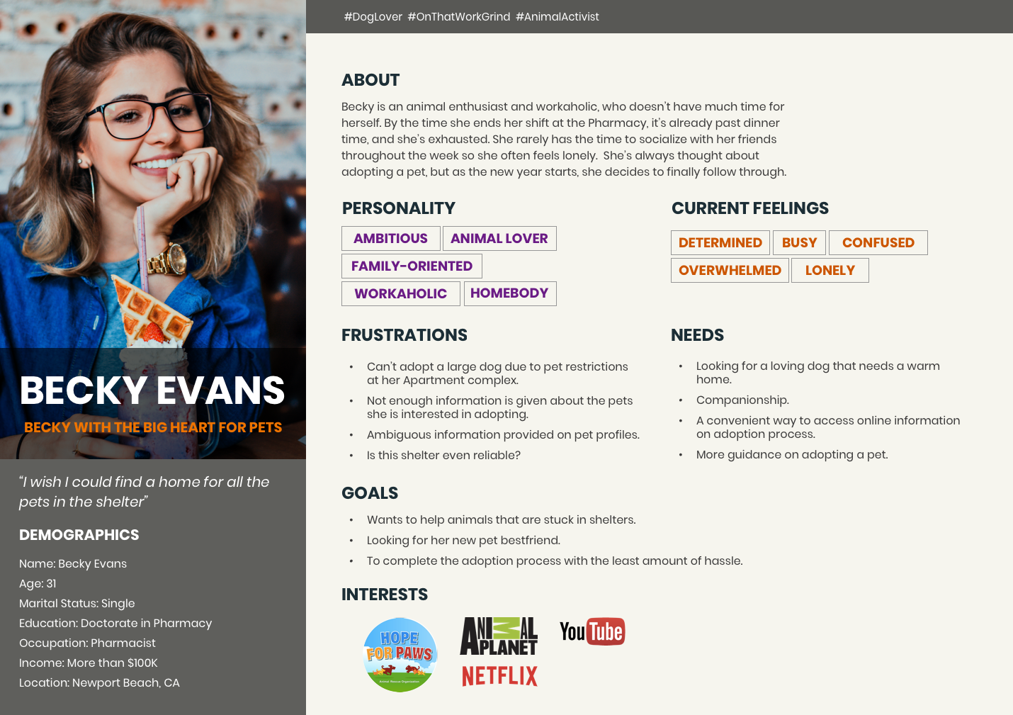
By creating an Empathy Map we began to explore our hypothetical user pain points, needs, and goals. This exercise provided further insights to our interview and survey results.
After our group compiled all the data from the Empathy Map we were able to refine our User Persona, Becky Evans. Our User Persona reflected the same frustrations and needs as the majority of our interviewees such as:

Frustrations:
“Not enough information is given about the pets she is interested in.”

Needs:
“More guidance on adopting a pet.” or “A convenient way to access online information on adoption process.”
After creating Becky, our User Persona,, we proceeded to create a journey map that illustrated her possible experience with the adoption process that we were focused on improving.

JOURNEY MAP

Our team proceeded to map out a journey our user persona would potentially experience through the AALOC website. The Journey Map covered the stages of the initial inquiry and discovery phase of the website, to the selection of the pet of interest, to filling out the adoption form, and then finally to requesting an appointment to meet the pet of interest face-to-face.
Areas of opportunities that we discovered and wanted to highlight were:
  1. To create a responsive platform that would allow our user to have access to the AALOC website on any device.
  2. To make it easy to learn about the animal as well as learn about the adoption fees.
  3. To have an adoption form linking to the site so that they can get started with the adoption process on the spot.
After analyzing the hypothetical user journey, we highlighted the possible pain points and opportunity areas of our user base, which allowed us to identify and define our problem statement.

DEFINING THE PROBLEM

Future Pet Owners currently visiting the AALOC website are not able to complete the adoption process online efficiently. The information provided on the website lacks clarity and consistency, causing a lot of confusion for the user. By making it possible to easily access the adoption call-to-action (CTA), the website can help guide the user through the simplified steps of the adoption process.

We will know we have succeeded when we observe an increase in completed online adoption application forms or adoptions overall with a decrease in abandoned online adoption forms.

PHASE 3

Develop - Ideation and Evaluation
In the Development phase we began to ideate the concept of AALOC’s redesign. We accomplished this through our wireframing process, user flow site-mapping, as well as creating a brand style guide to establish consistency.

REVISING THE CURRENT SITE MAP

Our team noticed that the current site’s content needed a bit of an update. During this process we aimed to reorganize the page sections and contents, hoping to minimize the information the user would have to process and navigate through.
By combining similar, relatable pages we minimized the number of sections that existed on the AALOC website. We then decided to reorder the sections based on the user feedback we had received, in order to prioritize the information the users seemed to seek the most. After multiple revisions we finally created our revised site map, shown below.

PRIMARY USER FLOW

Following the creation of our revised site map, our team focused on prototyping the adoption user flow. As mentioned previously, the adoption process was perceived to be one of the main features of the website, so our team naturally gravitated to create the wireframes for this process first. Below is the primary user flow that will later be prototyped in the final phase of the double diamond process.

1ST ITERATION OF WIREFRAMES

Once the site map had been created, we then proceeded to develop basic wireframes and low-fidelity wireframes.
Each of our team members created their own interpretation of the redesign and presented their design solutions to the rest of the members. From there we collaboratively looked over the designs, marking which design suggestions we wanted to iterate upon further, and the design suggestions we wanted to omit.

ESTABLISHING BRAND IDENTITY & DESIGN CONSISTENCY

After our team had discussed the features and redesign of the website, we proceeded to create a style guide that evoked warmth, boldness, and friendliness. Due to the feedback we had received regarding the lack of aesthetic appeal, we ventured into a more adventurous color palette.
While incorporating brighter and bolder colors into the style guide, our team still wanted to maintain the professional and polished reputation of a non-profit organization. We aimed to balance modern professionalism with playful boldness.
The same inspiration followed our typeface and font family choices. Our main headings were displayed with a more playful typeface while the body text remained modern and polished.
Creating a Responsive Website:
We believed that the AALOC website should have a responsive web design so that users on all different devices would have a positive interaction with the interface. Also to optimize the accessibility options for various users.

After establishing the style guide, our team proceeded to create the high fidelity mockups.

PHASE 4

Deliver - Implementation and Build, Test, Iterate
In the final phase of the Double Diamond process, our team began to build, test, and iterate the final design solution focused around improving the adoption process.

HIGH FIDELITY WIREFRAMES & MOCKUPS

After the creation of the style guide and brand identity, we proceeded to the high fidelity wireframes and mockups. Again each of our team members tackled the mock-ups with their own approach, and then came together to discuss our approaches.

USABILITY TESTING

Once we created the first iteration of high-fidelity mockups, we proceeded to prototype the screens on InVision to put it to the test.  We conducted multiple usability tests with at least 6 different individuals.
The individuals we selected to conduct the Usability Tests with were individuals who identified themselves as:
  1. Technologically Savvy
  2. Previous Adoptees or Prospective Adoptees
The Task:
We asked the individuals to navigate to the adoption page and proceed as if they were interested in adopting a pet.

Observations:
The majority of the users utilized the menu icon as their primary navigational tool through the application.  The average pace of the usability testing session lasted between  1-2 minutes.  Some users spent extra time looking through adoption requirements and other content they found interesting. Fortunately 5/5 tests returned with positive feedback with the new redesign.

Key Feedback:
Although the feedback regarding the redesign was positive, there were still constructive comments that our team wanted to apply to our 2nd iterations. The main comments and responses we received revolved around the following:
With all the feedback and comments we had received, our team focused on applying the revisions for our finalized prototype of the AALOC redesign.
  1. Prioritizing the Adoption Requirements.  3/5 users requested that the adoption information (fees, requirements, steps to adopt, etc.) was provided early on before the adoption form.  
  2. Users commented on the favoriting option on the AALOC website, stating that it was a neat function that seems very helpful.
  3. As a site filled with lots of context and information, users gave our team the feedback that highlighting keywords would help maintain user’s focus and ability to pick up key facts and information without having to go through the entire block of text.
With all the feedback and comments we had received, our team focused on applying the revisions for our finalized prototype of the AALOC redesign.

the new aaloc

Design Solution - Adopting Process Prototype
For the final prototype, our team created a mobile, tablet, and desktop version to emphasize the desire to create a responsive redesign. The AALOC prototype was created through InVision.

CONCLUSION

Future Considerations
In conclusion, our team enjoyed the process of redesigning the AALOC website. We believe that we were able to address the primary concerns of general usability and improving the overall experience of the current website to the 2.0 website.

If we had more time, our team was interested in incorporating more unique and interactive features such as Pet-Matching, Virtual Meetings with pets of interest, etc. For now we are happy with the overall result of the redesign given our timeline of 2 weeks. I hope in the future that AALOC will look at our suggestions and adopt some of the new features that we proposed to increase the amount of adoptions completed through their online platform.
GO BACK TO TOPVIEW NEXT PROJECT